
OVERVIEW
Shubham Prakash - Founder
Shivani Kokkonda - Director of Marketing
Moumita Sen - Director of Operations
Shubhi Sharma - Manager, Content
My Contribution
I facilitated the visual design and rebranding workshop. Building upon previous branding workshops, I guided the team towards deciding upon the visual language and typography of the website.
My design and communications expertise helped build upon the branding system as well.
Finally, I influenced the team decision to work on Webflow and set up a keyword naming system to ease the workflow of the developers working on Webflow.
WORKSHOP #1
The Status Quo
In a five-day workshop that spanned over a week, we consciously worked on reviewing the current goals and communication channels of the organization. We reviewed over 150+ omni-channel communications over social media, orchestrated events and visual designs to go about understanding how the current non-profit organization communicated its presence to the target audience.
Brand Audit
We began with talking about We Do Good and what it represents. We went around one by one, each answering the following questions and noting it down. At the end, the scale of criticality was dependent on the questions that had the most mismatch of answers.
The questions asked which helped us assess the brand personality of We Do Good were -
Why We Do Good ?
For whom do we exist ?
What is the personality of We Do Good ? How is We Do Good portrayed outside? Should it be different to different set of people ?
How does We Do Good sound to everyone ? Does it sound similar to everyone ?
" The uncertainty surrounding the brand personality made us realize that the organization needed a much more consistent branding and visual language to better connect with its audiences. "
WORKSHOP #2
Brand & Strategy
Over the next month, we brainstormed and developed brand attributes, target groups and corporate goals. Branding is a forever-evolving process; the more we can put the product in front of customers and gather their feedback, the more informed our decisions can be. Therefore, we planned to review and update our branding collateral every three months (quarterly).

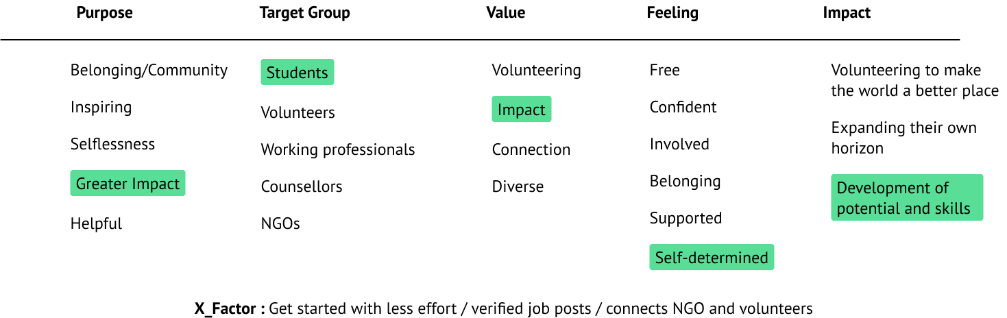
Brand Attributes
We began with brainstorming and prioritizing brand attributes in various categories and set the base for critical branding collaterals :
Purpose What is the ultimate reason for the existence for We Do Good? What cause does it stand for?
Target Groups How would we describe our target audience?
Value The market share to capture and the value we offer that makes consumers choose us over others
Impact How does the brand seem to be perceived?
X-Factor How are we different from others?
Crafting our brand purpose statement
In order to motivate employees to work collectively towards a shared goal, we brainstormed ideas to give our brand a purpose. Moreover, purpose-driven brands often win their customer’s loyalty.
We took the help of Oglivy’s framework to come up with a brand purpose. We ideated a short phrase that would show the brand’s POV towards the world and one, which would lie between the intersection of two ideas -
Cultural Tension : It’s what people care about and wish to actively participate in whilst supporting the company.
Brand’s Best Self : The one thing that makes you truly great and unique.

We Do Good believes that we could create a meaningful impact by bridging the gap between volunteers and non-profit organizations
Reviewing the positioning and Differentiation Of The Brand
By brainstorming and prioritizing ideas in terms of market domination and value proposition, we outlined the positioning and differentiation strategy. Basically, positioning is the reason for similar products serving different purposes whereas differentiation is the value that nobody else offers . In conclusion, ‘positioning’ is more strategic and ‘differentiation’ is what gets communicated.
We then brainstormed on several brand attributes to focus further on the positioning statement.

WeDoGood is a one-stop platform, determined to provide a dynamic space to those who are dedicated to deliver impact while encouraging individual growth.
Giving Our Brand an identity
We quickly came up with a roadmap to solve the problem of how we wished for our brand to be perceived. This could be achieved with the help of two elements; voice and tone. The voice expresses who they are, the brand identity. The tone, on the other hand, is the choice of the words used.
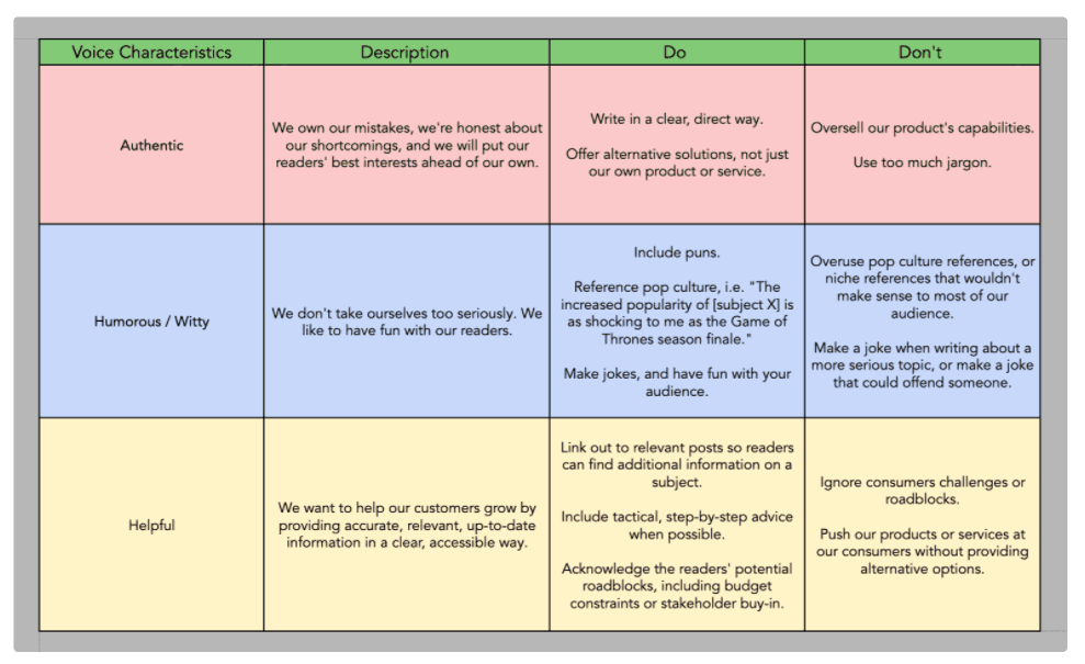

The We Do Good brand voice is considerate, genuine, clear, and consistent.The We Do Good tone is funny, formal, respectful and enthuiastic.
RESULTS OF THE WORKSHOP
By brainstorming and prioritizing ideas quickly and efficiently, we were able to come up with our branding collaterals quickly, within a month. This helped us set a direction to the restructuring and redesigning of the website.
MISSION STATEMENT
We bridge the gap between potential volunteers and non-profit organizations through a one-stop transactional platform to create meaningful impact and deliver corresponding solutions.
VISION STATEMENT
Strengthening the culture of volunteerism across communities.
TAGLINE
WeDoGood for those dedicated to do good.
LEARNINGS
The branding exercise was immensely helpful in terms of setting up an initial branding document describing the organization's personality. Having the team heads from different departments to participate in the branding exercise helped gain multiple insights from different perspectives. The frameworks used (Oglivy and Nielsen Norman Group) helped in putting a proper structure in place for the initial phase of setting up a branding collateral. In the future, using multiple frameworks will help us develop our branding statement’s better; to be in line with the brand’s identity.
Also, I realized that the rating by numbers is kinda abstract. For the future I‘d prefer the effort impact mapping exercise, since it is way more tangible by evaluating the ideas by needed effort and expected impact, categorizing them into “Do now” (low effort, high impact), “Make it a project” (high effort, high impact), “Make it a task” (low effort, low impact) and “Skip” (high effort, low impact).
WORKSHOP #3
Finding A Visual Style
After the branding workshops conducted, I took the mission statement and the brand attributes to craft three different design directions aka stylescapes to present to the client right before starting the second workshop.

Logo
The team sat down to discuss the various elements that would determine the brand identity :
We knew that audiences would recall the logo more easily than the words of the brand. The logo is indicative of a progressive larger impact.
Colours And Type
The moodboard that resonated with the team was that of the first one. Everyone felt that the colours indicated stability and growth. Primary Colour : Greenish Blue. Secondary Colour : A complementary shade of blue that indicates uniformity and stability. A yellow colour to complement the colour palette to make it appear refreshing. The team agreed to begin with limited colours and then to gradually increase the colours in the palette as the brand expanded.
The font selected was Roboto which is a stable and easy-to-read font that will help instill trust in users towards the brand


Imagery
Photography can really help the consumer see the product or service clearly or find an emotional, personal connection. We decided on imagery that promoted community and togetherness. Our target audience are primarily college students, looking to make an impact and wanting to be part of a community.

Web Design
Everything was finally sewn together! You can check out the live website hosted on Webflow here.


CONCLUSION
Due to the flawless collaboration, after the workshops hardly any revisions were required, neither in information architecture nor in visual design. As a bonus, Anian Hering was by my side, observing me how I do workshop facilitation and giving me honest and valuable feedback – that was awesome.
As a learning: Make sure to really (I mean, really really) get the expectations of the group right and to clearly communicate the exact goal of the individual exercises – I thought I did so, but I felt a lack of understanding here and there.
Since I don‘t know all the technical details of building a Wordpress site, some concepts were way more complex to implement, respectively way more complex to maintain by the client. Generally – and as I‘m able to do so – I would prefer to keep up the fast pace of the process by developing the website myself and being able to adjust little details without too much effort.
However, if there was more time, I would divide each of the workshops into two shorter days to keep up the focus. In addition, instead of two, I would build at least three personas, also run the prioritization exercise for revenue, and test the sitemap and site structure more thoroughly.